15 Ways to Help (or Donate to) Victims of California Wildfires
Updated 10.14.17 at 07:02 AM PST
The death toll continues to rise, and reports are now saying that at least 31 people have been killed by the California wildfires. Sadly, these Northern California wildfires are now the deadliest in the state’s history.
Unfortunately, the death toll is expected to rise as search and rescue continues in the coming weeks, with hundreds of residents still missing.
That is all devastating to hear, and the fire continues to burn.
A recent report from the Washington Post states that, “As authorities continue assessing the damage from the most devastating spate of wildfires to strike the state in modern history, the blazes are burning mostly uncontained — with winds likely to return this weekend, breathing dangerous new life into the deadly arc of flames.”
It’s time to act and do what we can for the victims of this unimaginable tragedy.
Whether you want to raise money, donate to, or volunteer for the victims of these wildfires, the people of Northern California are going to need your help.
Broken out into 14 “ways to help,” we’ve compiled a comprehensive list of how to help California wildfire victims, where to help, and what’s needed.
Combined within this list, you’ll find 60+ ways to help the victims of the Northern California wildfires.
Here’s how you can help with wildfire recovery in Napa and Sonoma:
- Donate to a fund to help 10 truly needy families
- Start a crowdfunding campaign.
- Volunteer.
- Donate to a Fundly Certified fundraising campaign.
- Drop off donated items at designated pick-up points.
- Get your donations matched.
- Support local fire departments.
- Give to community nonprofits.
- Create a company matching campaign.
- Donate to a crowdfunding campaign for a local family, business, or community.
- Share this page (it’s free and the average share raises $97)
- Donate directly to a family who has lost their house
- Help out impacted pets and animals.
- Visit fundraising restaurants and stores.
- Bonus: Donate right now
We’ll begin with option #1, helping 10 needy families.
1. Donate to a fund to help 10 truly needy families.
The country has really come together to offer an outpouring of love and support for the impacted communities. Millions have been donated to nonprofit organizations in the Napa and Sonoma areas that will help the suffering families and communities recover, which is fantastic.
But for the truly vulnerable families they need an immediate helping hand.
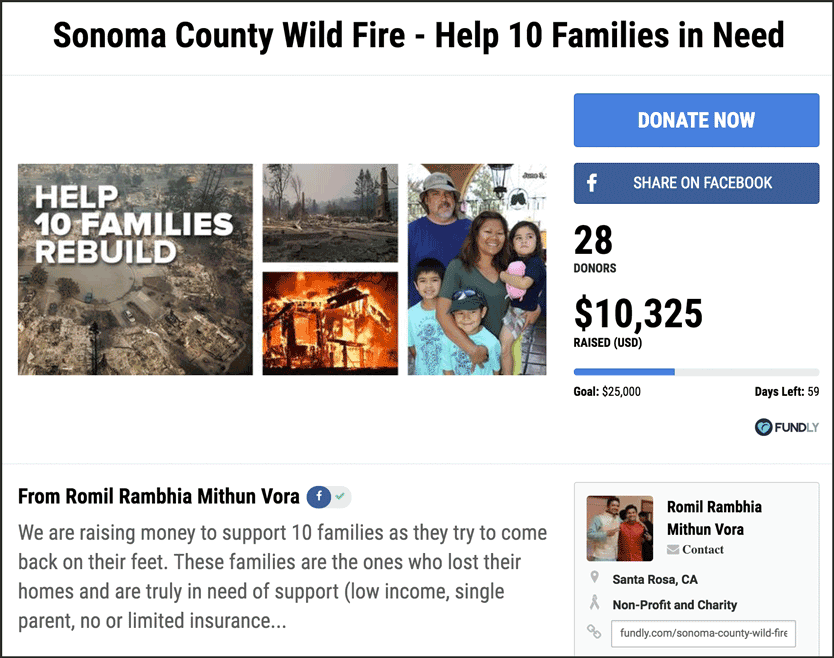
Fortunately there are prominent individuals in the local Napa and Sonoma communities who are aware of the reality on the ground and raising funds to support the most vulnerable. They’re supporting local families who lost their homes and are truly in need of support (low income, single parent, no or limited insurance, 3+ kids, health issues or death etc).
Here’s one such campaign raising funds to support 10 families with a minimum of $2,500 per family.
These funds will go to families such as Sameth & Larry Broderick and their three boys. Sameth is a technician at Medtronic, Inc. and she lost her home and is in desperate need of support to get her family’s life back in order.
2. Start a crowdfunding campaign.
If you or someone close to you has ever dealt with the aftereffects of a fire, you know it can be extremely costly. The wildfires in Northern California on Sunday night and Monday morning have absolutely ravaged structures in the region.
While the fires are still raging on in Northern California wine country, we know that at least 3,500 structures have been destroyed and almost 20,000 residents have been forced to evacuate.
Northern California is going to need our help to rebuild. Most residents have not even been able to return home yet to see just how much damage has occurred.
Historically, crowdfunding campaigns have proven extremely effective in helping individuals and groups raise a lot of money to help in the aftermath of fires.
If you want to raise money for the wildfire relief effort in Santa Rosa and other parts of California, you, too, can start a crowdfunding campaign.
The process is simple:
a. Click here to start your fundraiser for free
b. Set a goal.
c. Write a description and gather photos.
d. Design your campaign page.
e. Launch your campaign.
f. Promote, promote, promote.
g. Collect donations and send money to wildfire relief.
3. Volunteer with a local nonprofit.
If you don’t have cash to give or you want to go even further, consider volunteering. Here are some of the most helpful resources for individuals located in Northern California:
- Register as a disaster service worker
- Open up your house to an evacuee for free through Airbnb
- Shelter an animal. If you have space in your house for an animal it’s a great help to families who lost their homes and shelters that got evacuated. You can learn more helping animals with the relief effort here. We also have an entire section dedicated to animals later on in this list, for you to browse.
- Foster a pet for a family who has lost their home
- Donate food to local food banks. Below are links to three heavily impacted county food banks:
- Go to the Tubbs Fire Safety Check-In Facebook page to find info about volunteering in the region.
- Sign up with the Red Cross to help evacuees.
- Drive clothes to victims in need. Love on Haight in San Francisco is currently collecting and distributing clothes to fire victims.
- See if you can help Home Care Assistance transport seniors to safe temporary housing by calling 925-817-0416.
- Register to volunteer at the Sonoma Community Center (276 E. Napa Street, Sonoma)
- Host an individual or a family through Petaluma People Services Center (email them at [email protected])
- If you have spare space at your house, fill out this crowd-sourced Google Doc where you can list your home and connect with evacuees in need of a place to stay.
- If you’re a trained counselor, grief and crisis counselors are needed at Sonoma Valley High School. They’re asking anyone who is licensed and able to call (707-888-5863).
No matter how you choose to volunteer, what matters is that you do. If you’re able to and in the area, you could be making a huge difference in the lives of your neighbors.
In the aftermath of these destructive fires, you have options for support that go beyond donating.
4. Donate to a Fundly Certified Fundraising Campaign (RECOMMENDED).
If you’re unable to start your own crowdfunding campaign, you can still help by donating to a campaign that is benefiting the same cause. At Fundly, we even have certified campaigns to donate to if you want to ensure your donation goes to worthy organizations in California.
Here’s one campaign you can give to that is aimed at supporting local fire departments and regional relief organizations, the “California Relief Fund” —
You can donate by going to https://fundly.com/california-fire-relief-fund or by using the below button.
5. Drop off donated items at designated pick-up points.
Police and emergency officials are requesting people stay off the roads and keep emergency lines clear. While it can be tempting to drive north to deliver donated items like food, basic toiletries, and water, it’s best if you bring your donated items to a designated pick-up spot.
Then, you can let the expert transport your donated goods to the struggling regions in a safe and orderly fashion.
Below, you’ll find a listing of the places in and around the region where you can bring donated goods and ensure that they make it to the victims of the wildfires in wine country.
- Tutto Capelli Salon in San Carlos — You can donate pet supplies, baby supplies, feminine products, phone chargers, and toiletries.
- Ryse Youth Center in Richmond — They are asking for filters and face masks, diapers (adult and child), and basic toiletries.
- Del Cielo Brewing Co. in Santa Rosa — The brewing company is hosting an all day drop-off this Sunday (10/15).
- Jewish Community Center in Berkeley — Staff at the community center are requesting clothing and toiletries (drop-offs are at specific times, so check with the JCC about when you can bring your donated items by).
- The following businesses in San Francisco are serving as drop-off points for supplies. Keep in mind that the most needed items are non-perishables, phone chargers, air mattresses, yoga mats, shoes, water, cots, pet food, packaged underwear, basic toiletries, and face masks.
- Mauna Loa
- Tupelo
- Hara Club
- Taverna Aventine
- The Dubliner
- The Alembic
- Liholiho Yacht Club
- William Sonoma (3250 Van Ness)
- Fort Point Beer Company
- Alembic
If you’re already within the region, here are some local spots where you can donate goods and items:
- Santa Rosa — Veterans Memorial Building and Hall at 1351 Maple Avenue
- Petaluma — Petaluma Community Center at 320 N. McDowell Boulevard
- Petaluma — Sonoma-Marin Fairgrounds at 175 Fairgrounds Drive
- Napa — Napa Valley College Gym at 2277 Napa Vallejo Highway
- Yuba County — Yuba-Sutter Fairgrounds Evacuation Center at 422 Franklin Avenue, Yuba City
Please note with all of these pick-up points, times and availability are subject to change. It’s best to do a bit of research and confirm before heading to any specific location.
And as always, if you can, try to donate funds to the nonprofits and community foundations serving the region. That way, the organizations with boots on the ground can purchase the most necessary items and make the most impactful donations possible.
We want to make sure the right donations end up in the right hands.
6. Get your donations to wildfire fundraisers matched.
Did you know that between 15-19 million individuals work for companies with employee matching gift programs? That means for many of you, your donation to a nonprofit can be matched often at a $1 for $1 rate.
We’ve partnered with Double the Donation to make this information about which companies match donations along with forms, guidelines, and instructions available for free as part of our commitment to helping with the Fire Relief Efforts.
You can check to see if your company has a program using the Double the Donation search tool below. Just type in the name of your employer in the search bar.
Make sure to type in your spouse’s company as well and share this page so everyone who’s supporting the fire relief efforts can ensure their donations go as far as possible.
7. Support local fire departments in Napa, Sonoma, and the whole region.
The firefighters doing the dangerous work of putting out these fires truly need our support.
One way to show your support for their efforts is to give to the California Fire Foundation.
The California Fire Foundation provides “programs that support those on the front lines and aid the communities throughout California before, during, and after the alarm.”
They have a program, named SAVE (Supplying Aid to Victims of Emergency), through which they are “mobilizing direct assistance to many of those who’ve suffered catastrophic losses from the North Bay Firestorm.”
Through the SAVE program, frontline firefighters are able to provide $100 gift cards to victims of fires who are in immediate need of basic necessities, like toiletries.
The program is only available to officially organized fire departments and districts.
8. Give to community nonprofits working in Northern California.
One of the best things you can do in the wake of any natural disaster is to find local organizations equipped to handle the recovery and support those nonprofits.
You can send your money or donate to the organizations, depending on where you live and what your skill sets are.
As these fires continue to burn in Northern California, many nonprofits are likely to step up to help those affected by this terrible firestorm.
Here are a few steps you can take to help the victims and get involved with community nonprofits:
- Support a local shelter housing evacuees (list of shelters available here).
- Give to a food bank helping the displaced victims.
- Donate to the Napa Valley Community Foundation
- Donate to the Sonoma Humane Society
- Donate to the Napa Humane Society
- Donate to the Yuba-Sutter SPCA
- Give to the Red Cross groups working in the region.
- Support local churches and organizations that are providing food and shelter for victims.
- Donate to the Sonoma County Resilience Fund which is dedicated to addressing mid- to long-term needs of Sonoma County following the fires.
- Send fire relief donations to Savings Bank of Mendocino County.
- Donate to the Community Foundation of Mendocino County.
- Donate to the United Way of the Wine Country, which is directing all donations to “area fire relief and recovery efforts until further notice.”
- Give to a local Santa Rosa food pantry, F.I.S.H, which reopened on October 13th.
- Bring cash donations in person to the Suisun City KROC Center (located at 586 E Wigeon Way, Suisun City).
- You can also give cash donations for animals supplies via phone by calling Western Ranch Supply at 707-439-7880.
- Make a financial donation to the Redwood Empire Food Bank.
- Support North Bay Fire Relief through the Redwood Credit Union. According to their site, “In partnership with the RCU Community Fund, The Press Democrat, and Senator Mike McGuire,” they are, “now accepting financial donations to aid relief efforts and assist victims of the 2017 North Bay fires.” Donations are tax deductible.
- Donate to the Salvation Army that has multiple teams on the ground providing meal services at evacuation centers.
As the state and the country launch into recovery mode, more and more organizations will begin to join the relief effort. We’ll be adding to this list as more information becomes available.
9. Get Your Company to Set Up a Fundraising Match Campaign.
If you’re a business owner set up your own fundraising campaign and offer a matching gift. Or, if you work closely with your HR or Community Relations teams, see if they’d be willing to set up a fundraiser with a matching component. Typically we see companies go one of two routes:
- Match donations for a disaster at a $1 for $1 or $2 for $1 rate, up to a maximum of some amount
- Offer a challenge grant where if employees, clients, or partners donate above a certain threshold, the company matches it.
While the California Fire Relief Efforts are just starting and we expect to see more corporate or small business matching campaigns pop up, here are a few samples from other recent disasters:
- The McShane Company is matching up $50,000 (here’s the fundraiser)
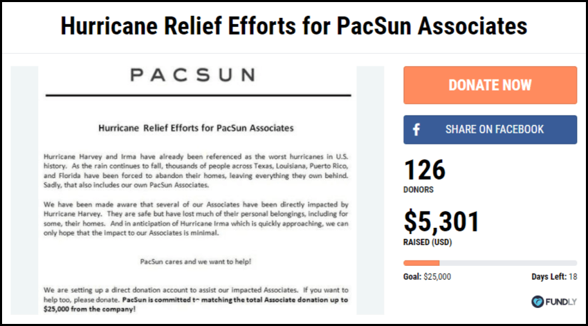
- PacSun is matching up to $25,000 (here’s the fundraiser)
- Associated Credit Union is matching up to $25,000 (here’s the fundraiser)
- Index Festival of Houston is matching up to $5,000 (here’s the fundraiser)
- W. Bradford & Co is matching up to $2,5000 (here’s the fundraiser)
- Philips Lighting is matching up to $40,000 (here’s the fundraiser)
Here’s a sample from the recent hurricanes that you can model your company matching campaign off of.
10. Find a different wildfire crowdfunding campaign to support.
To find an existing crowdfunding campaign, check out the disaster relief campaign section on our website.
Search for words related to the wildfire. For instance, you might search for “Northern California Wildfire” or “Santa Rosa Fire” or “Napa Valley wildfires.”
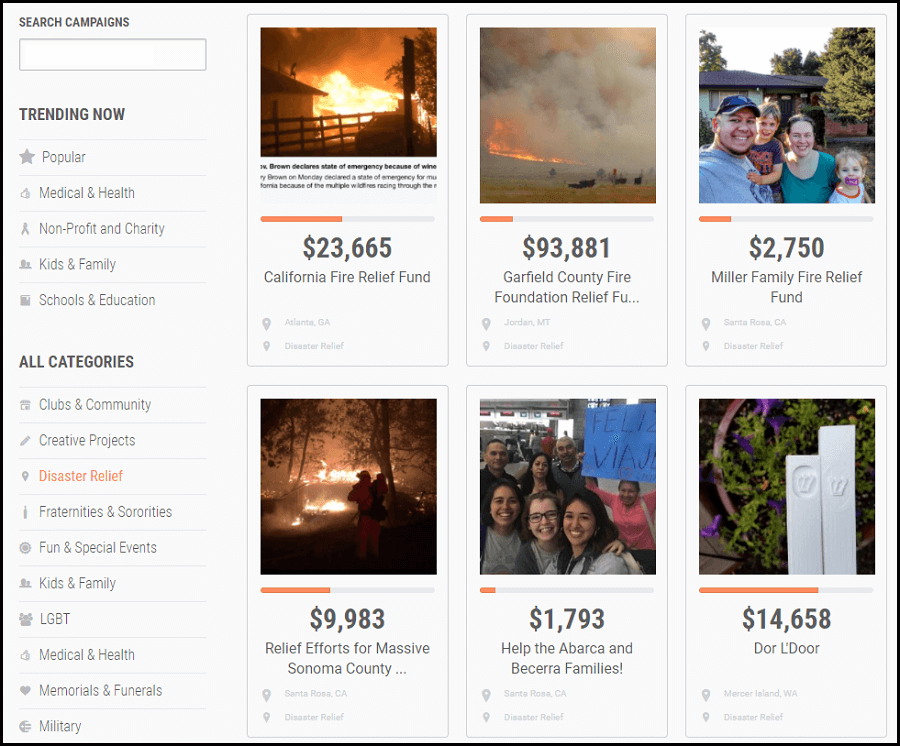
To start, you can browse our category for disaster relief efforts, such as fire recovery. Click the image below to head to Fundly’s disaster relief category.
With the recent hurricanes, fires, and earthquake in Mexico, there are a ton of worthy families and organizations in need of financial assistance:
If you’re ready to donate, here’s a second certified campaign, this one is actually being run by our Fundly team.
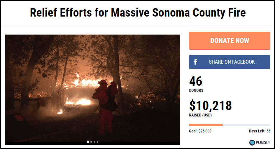
If you’re not aware, Fundly is based in Petaluma, California, an area heavily impacted by the fires. We want to raise money for our neighbors who have lost their homes and businesses in the wildfires.
We’re running a campaign called “Relief Efforts for Massive Sonoma County Fire.” Click the image below to visit the page and donate.
You can donate by going to https://fundly.com/massive-sonoma-county-fire or by clicking on the below button.
11. Share this page on Facebook and Twitter! The average share raises $97.
If you’ve already contributed to a fundraising campaign we encourage you to share what’s going in California and encourage your friends and family to also contribute. You can write your own post or we’ve made it really easy for you to share this page on your own Facebook or Twitter accounts.
Each time someone share a fundraising campaign it’s estimated to generate an additional $97 in donations. Please take a minute or two to share this!
Share on Facebook
Share on Twitter
9 Excellent Ways to Help (or Donate to) Victims of California Wildfires! You can make a difference! https://t.co/fV0CnBEs5X pic.twitter.com/c3W1M7tkOC
— Fundly (@Fundly) October 11, 2017
12. Donate directly to a family who has lost their house.
In the midst of all the news coverage and larger stories talking about entire towns and regions, it’s easy to forgot the dramatic impact that these wildfires across Napa, Sonoma, and other cities have directly on individual families.
With more than 3,500 homes and buildings destroyed and many more neighborhoods at risk, lives have truly been changed. As this fire rages on, more and more families are going to be left without homes and most of their possessions.
It’s an unbelievably difficult situation, and these fires will, without a doubt, place extreme financial hardships on many of the individuals who live in the region.
At Fundly we’re honored to help many of these families raise money from friends, family, and strangers to help get them started on the long recovery journey.
Below are just a couple fundraisers currently being run on Fundly by individuals in the Northern California region. Take a look and consider giving:
13. Help Out Pets and Animals Impacted by the Wildfires
With the fires still raging on, many families are struggling to care for their animals.
Luckily, lots of organizations and groups have stepped up to the occasion to help out.
Here’s a long list of nonprofits and groups you can donate to and volunteer with to help our four-legged friends recover from these tragic fires.
- AKC Reunite – Helps reunite owners with their pets
- Community Foster for Tubbs Fire Animals – You can volunteer to foster pets affected by the fires.
- Local humane societies will are providing rescue and aid services now and will continue to do so. They need funding. Here’s a shortlist:
- Wine Country Animal Lovers – Local group helping animals in need
- Jameson Animal Rescue Ranch – Currently accepting donations to rescue displaced animals.
- Milo Foundation – The animal rescue group was forced to evacuate due to the fires and needs places to shelter animals.
- Sonoma County Animal Services are accepting food and other animal supplies as well as financial donations.
- SPCA of Solano County needs cat food, kitty litter, towels, beds, leashes, blankets, cleaning supplies, and funding.
As you can see, if you’re looking to help animals in the region, there are plenty of ways in which you can do so.
14. Visit fundraising restaurants and stores.
While this won’t be relevant for everyone, if you happen to live in an area near the wildfires, you might be close enough to shop at or eat at a fundraising store or restaurant.
What do we mean by “fundraising store or restaurant?” It’s simple. In most cases, these businesses are agreeing donate a portion of their proceeds to charities working to help California wildfire relief and recovery.
Check out these opportunities:
- The Bay Grape is accepting donations (both money and goods), and they’re distributing them to relevant organizations and evacuees.
- New Delhi Restaurant is trying to raise $50,000, and the eatery is hosting a fundraiser to do so on October 28th. The restaurant’s owner has already given $1,000 to the campaign.
- The Dorian has pledged to donate 50% of all wine sales during their benefit event on the evening of October 12th.
- Chez Marius is giving 50% of dinner sales to the Red Cross.
- Le P’tit Laurent is also giving 50% of dinner sales to the Red Cross.
- Heritage Eats has pledged to donate 10% of all sales to the Napa Valley Community Foundation.
- Local Food Adventures will be donating 25% of the profits from booked tours and gift cards sold between now and October 15th. The proceeds are going to a Santa Rosa food bank, F.I.S.H
- The Drawing Board is providing a special menu to firefighters and fire victims indefinitely.
- The Albertsons Companies grocery stores in Nevada and Northern California are matching donations up to a total of $500,000 (this includes Safeway, Albertsons, Vons, and more). The money will go to disaster-relief organizations.
- Peet’s Coffee & Tea Shop is letting customers make digital or cash donations at any of its coffee bars through October 22. The funds are going to their North Bay Fire Relief Campaign. Gifts up to $10,00 will be matched by the company.
As with the drop-off locations, these fundraisers are subject to change, so it is important to call ahead and confirm before heading over to one of these restaurants.
But if you’re in the area, this is a great way to raise money for the victims.
15. [Bonus] Want to Provide Help Right Now? Donate to a Certified Fundraising Campaign
We recommend https://fundly.com/california-fire-relief-fund
It is so tough to see what’s occurring in Northern California.
We’re very thankful for the servicemen and servicewomen currently fighting the fires and working to keep everyone safe. These fires continue to spread and burn, and it is hard to know when this disaster will end.
But even after the flames fade, there will still be unimaginable damage to comb through and heal from. It’s important that we give now, and it’s important that we continue to give.
If you can spare the funds and/or the time, use some of the options above and show your support for the communities affected by the Northern California wildfires.


